Perspective
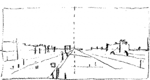
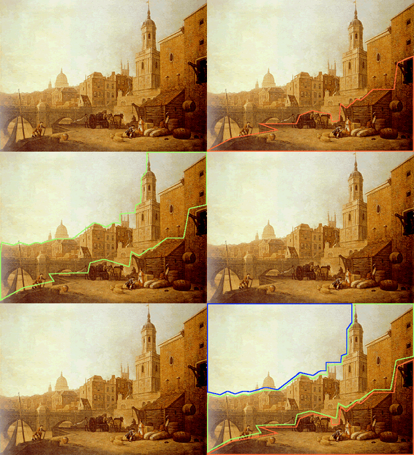
- Diagram after Canaletto Whitehall (1751)
- (Bowhill)
[click on the picture to enlarge it]
Diagram by Bernard Dunstan in Learning to Paint (1970), where he notes the dissociation between the point of convergence of the guiding lines towards the centre and the slightly off-centre placing of the main building, together with the modulating oblique of the wall as a broken line with vertical sections recalling the lines of the buildings.
Oblique perspective
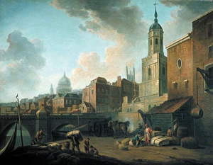
- Marlow, London Bridge (1762)
- (Courtesy of the Museum of London)
[click on the picture to enlarge it]
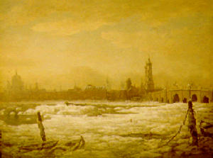
- Marlow, The Frozen Thames (1776)
- (Belvoir Castle)
[click on the picture to enlarge it]
The view in strong oblique perspective oblique relates well-known buildings in an unusual way: the spire of St Magnus Martyr stands out against the bridge and the quay, the whole is bathed in light. The same site was depicted with a different construction in The Frozen Thames.
Space is usually structured into
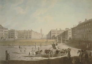
- Edward Dayes, Hanover Square
- (1788, © British Museum)
[click on the picture to enlarge it]
Some draughtsmen chose frontal views in which the perspective lines coincide with those of the buildings.
Dayes also practised oblique perspective in his View of Somerset House.
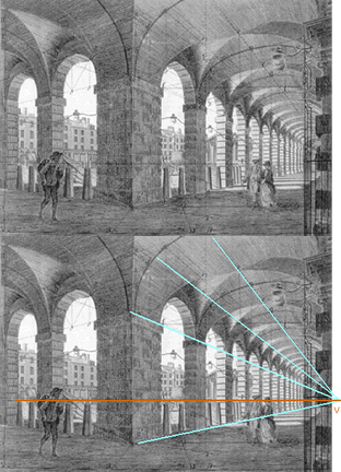
This drawing of Hanover Square by Dayes is an instance of a frontal view where perspectival geometry throws into relief architectural regularity.
The horizontals of the lateral façades of the buildings (the sides of the square and the street) converge, being on orthogonals.
The horizontals of façades turned towards the viewer (perpendicular to the preceding lines) remain parallel, being transversals.
The central vanishing point is close to the centre of the picture, on the horizon line where the receding lines converge (eg. the orthogonals); it corresponds to the height of the spectator’s eye, here supposed to be at a balcony since H is at the level of the first floor.
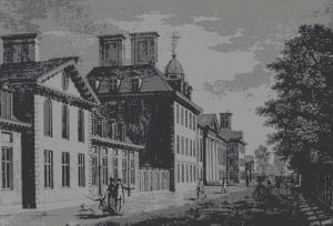
- Thomas Malton, “Chelsea Hospital”
- view from Perspective (1775, 1778)
[click on the picture to enlarge it]
The slightly oblique position causes a subtle lateral shift between the direction of the visual angle and the receding lines of the buildings.
Thomas Malton proposed a perspective system in which the focal point of spectator vision is distinct from the vanishing point. The horizontals placed in front of the viewer (the sides of the building) are not exactly transversals ; they do not remain perfectly parallel, converging towards a distant point to the left. The receding lines of the façades (perpendicular to the preceding lines), do not really coincide with orthogonals either, and the V point is distinct from C, the focus of vision.
He also made views of Buckingham House, of Covent Garden which is a case study to establish the spectator viewpoint, and of Bath.
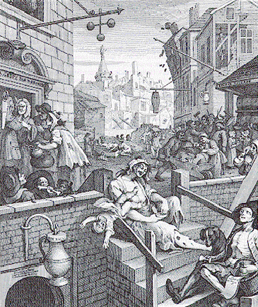
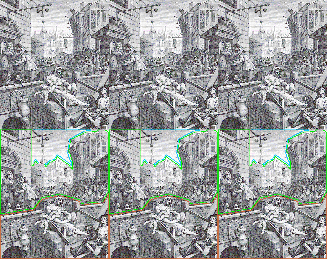
Perspective can also be used in a satirical manner, as in Hogarth’s Beer Street and Gin Lane.
Height of spectator viewpoint

- Thomas Malton, Covent Garden
- studies in perspective construction (Perspective, 1775, 78)
[click on the picture to enlarge it]
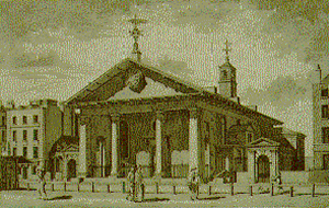
- Covent Garden
- [click on the picture to enlarge it]
It is important to determine how the height of the spectator’s viewpoint compares with the viewpoint of the figures in the drawing. The spectator can share their viewpoint, of be above them, or below them. As shown on the
, in the present case, Thomas Malton chose a horizon line at the height of the viewer’s eyes. He also made views of other London buildings, and wrote about urban design.
Covent Garden was depicted by Samuel Scott with a different spectator viewpoint.
Covent Garden is used by present-day architects as an example of Virtual Reality reconstruction.
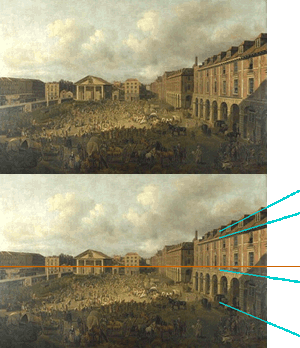
- Covent Garden by Samuel Scott
- (1756-58, By kind permission of the Museum of London)
[click on the picture to enlarge it]
The sense of townscape conveyed suggests that practices of pictorial composition are in harmony with the layout of the town. The spectator views the scene from a balcony on the first floor, as the horizon line shows. Scott used a high viewpoint to emphasize the unified design of the square; this dominant position is adapted to the site which was designed according to a master plan. The regularity of the architecture would also make it a good example for perspective views, such a Thomas Malton’s or Sandby’s.
Samuel Scott painted other London scenes, such as Westminster Bridge, using low-angle views on the contrary.
Beer Street and Gin Lane
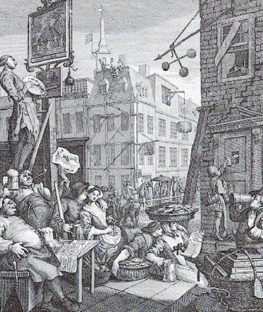
- Beer Street
- [click on the picture to enlarge it]
These two engravings (1750) were published to support an Act of Parliament limiting the disastrous use of gin. The prosperity of Beer Street, where the inhabitants are healthy and the pawnbroker’s shop (usurer’s) is collapsing since they no longer need to borrow money, is contrasted with the destitution of Gin Lane where houses are falling except the pawnbroker’s which is flourishing (it is marked by the sign of the three balls).
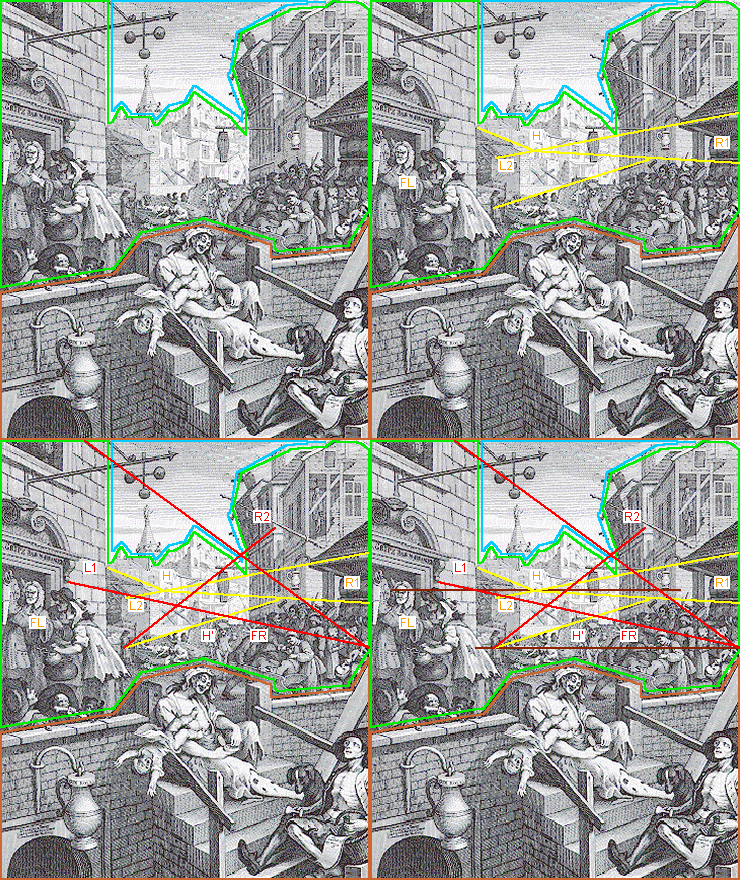
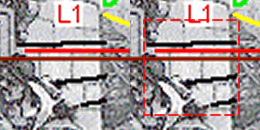
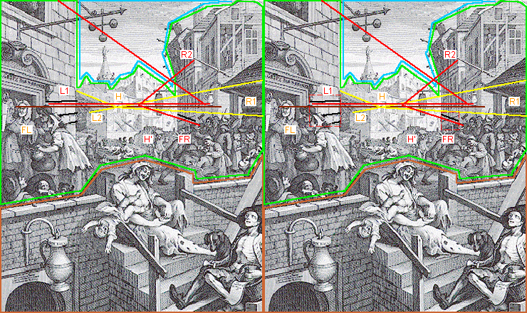
The intimately ordered and framed world of Beer Street with its harmonious oblique view is opposed to the space of Gin Lane with its broken levels, and its violently receding distances with inconsistent perspective.
Beer Street

- Beer Street
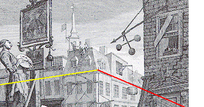
In Beer Street, the main buildings are in oblique view (seen on the angle), which was favoured by Hogarth as being closer to life than the frontal view with a central axis, a structure parodied in Gin Lane.
The receding oblique horizontals of the roofs and windows both on right and left converge on the same horizon.
The flagstones of the foreground also converge on the same line, but not on the same point, which shows that they are again placed obliquely in relation to the walls of the houses. Since they are slightly curved, stiffness is avoided.
These flagstones are also oblique in relation to the ground line, contrary to the usual orthogonal grid of paving stones in elementary perspective diagrams. This is a way of leading the eye into the picture in different directions, which gives a variety of movement favoured by Hogarth.
The oblique perspective scheme is underlined by the compositional effect of the pawnbroker’s sign, which is collapsing : it is placed on a main compositional oblique leading to the point where the horizon meets the left-hand frame. This oblique is symmetrical with the main construction line of the happy group below, suggesting a correlation between the prosperity of the population and the decadence of usury.
Beer Street puts into practice the rules of perspective.
Gin Lane
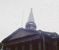
- St George
The stepped steeple of St George’s Bloomsbury by Hawksmoor (close to the thieves’ haunt of St Giles), pictured in Gin Lane.
St George’s was built in Bloomsbury itself to save the inhabitants of the newly-developed Bedford estates the trouble of having to cross the dangerous district of St Giles to go to church.
The traditional structure of space parodically subdivided into three distances emphasises the contrasts between the districts of London: the foreground and middle distance are the St Giles area, a place of drunkenness, poverty and crime, the distance is the safe district of Bloomsbury, represented by Hawksmoor’s architecture.
Hogarth has also practised a satirical
We may imagine what the view would have been if he had used

