Oblique views and shadows
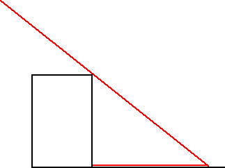
- lateral shadow
Though architectural drawings normally show a building in frontal view, townscapes usually select oblique angles.
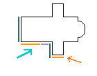
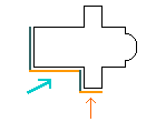
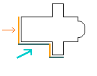
The orientation of buildings also affects the direction of shadows. There were two main practices in architectural draughtsmanship : assuming the sun to be placed laterally (the shadows being in a transversal plane, as horizontals), or assuming the sun rays to be at an angle of 45° in depth and width (thus making an angle of 35° with the ground), the building being in both cases in frontal view.
Since in paintings buildings are often placed obliquely, the direction of shadows varies according to the artist’s choice.
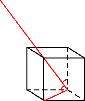
- solar ray as the diagonal of a cube
Hogarth, who expresses a preference for oblique views, often selects compositions combining slanting lines with light and shadow effects, as in The Rake’s Progress and The Four Times of the Day.
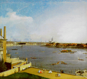
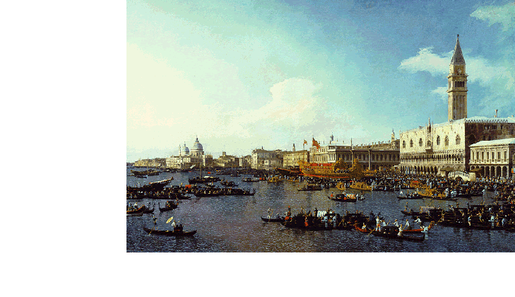
Canaletto places the sun laterally in relation to oblique buildings.
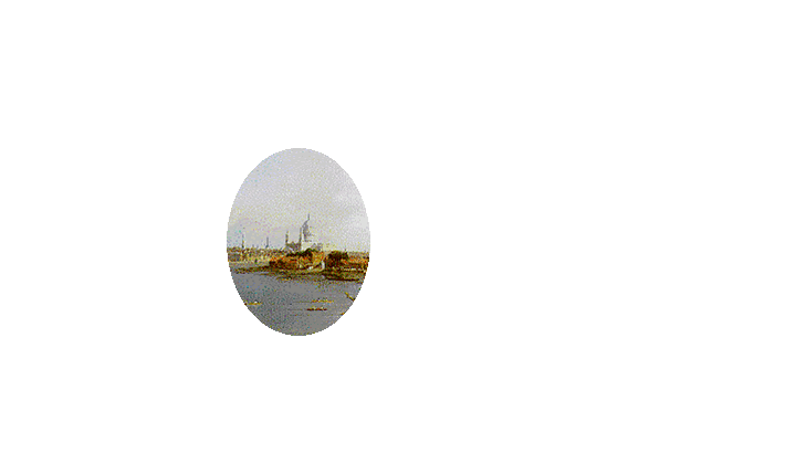
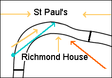
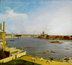
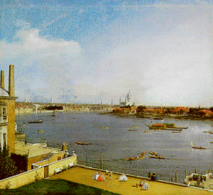
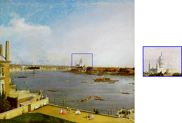
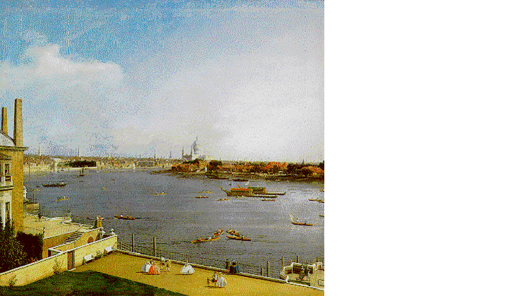
In his view from Richmond House, he elaborated on the pictorial practice of placing the light source casting shadows at an angle of 45°; the side lighting, leaving in the shade the façades turned towards the viewer, emphasises the receding distances in depth, most markedly on St Paul’s.
A rule (still applied in the drawings of Dayes) prescribed that painters should avoid “introducing the colour of an object in its shade” ; later Girtin chose to colour the shadows.
Hogarth
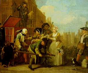
- Hogarth, The Rake’s Progress (1733)
- by courtesy of the Trustees of Sir John Soane’s Museum
[click on the picture to enlarge it]
The bankrupt rake is arrested for debts when coming out of his chaise in the fashionable district of the clubs in St James’s Street to attend a reception at St James’s Palace, which can be seen at the end of the street.
The view is towards the South (since St James’s façade opens on to the North), which enhances backlighting and slanting shadows to emphasise the drama.
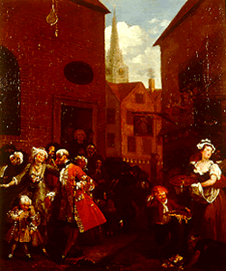
- Hogarth, The Four Times of the Day (1738)
- (Noon at Grimsthorpe)
[click on the picture to enlarge it]

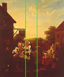
- Hogarth, The Four Times of the Day (1738)
- (Morning at Upton House)
[click on the picture to enlarge it]
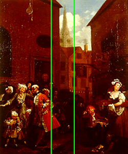
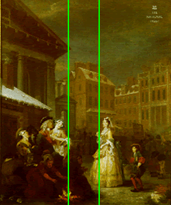
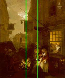
Morning shows Covent Garden, Noon the French Huguenot Church in Soho (one of them had been the first Governor of the Bank of England), Evening the suburbs of Sadler’s Well, and Night the dubious inns of Charing Cross.

- Hogarth, The Four Times of the Day (1738)
- (Night at Upton House)
[click on the picture to enlarge it]
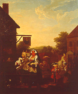
- Hogarth, The Four Times of the Day (1738)
- (Evening at Drummond Castles)
[click on the picture to enlarge it]
The paintings, which present a satirical view of the City, were meant to decorate the fashionable gardens of Vauxhall.
In this series, Hogarth uses ironical compositional echoes, the four paintings having identical lines of construction.
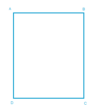
Hogarth uses time-honoured construction effects.
First, the square in the rectangle: if, in the rectangle of the painting…
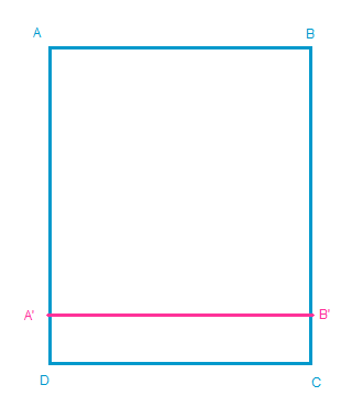
one draws a square with AA’ (or BB’) = AB (or DC), …
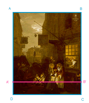
this new line falls on the key motifs of the picture, in this case the brasero and the lamp
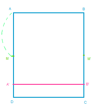
To obtain the vertical construction lines, one half of the height, AM…
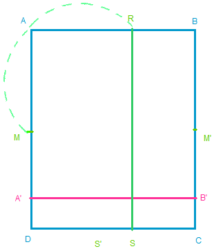
To obtain the vertical construction lines, one half of the height, AM is carried at right angle on the width, so that AM = AR
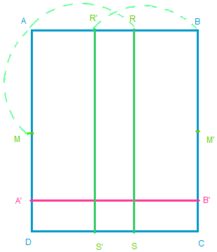
To obtain the vertical construction lines, one half of the height, AM is carried at right angle on the width, so that AM = AR (or BM’, or DM, or CM’ = BR’ or DS or CS’)

and it appears that these verticals also emphasise the brasero and the lamp:
the main horizontals and verticals indicate
the points of light
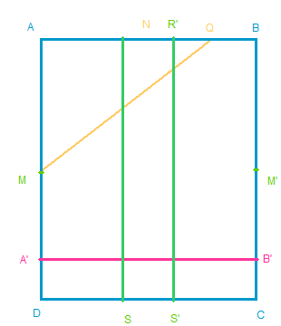
An oblique MQ can be drawn from M (the middle of the AD side) to point Q (placed at ¾ of AB).
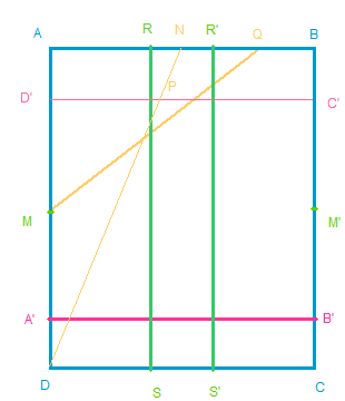
If the oblique DN is then drawn from the corner D to N (the middle of AB) ; let point P be its intersection with similarly obtained with a square in the rectangle starting from DC),
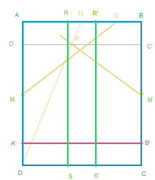
If the oblique DN is then drawn from the corner D to N (the middle of AB) ; let point P be its intersection with D’C’ (the counterpart of A’B’ similarly obtained with a square in the rectangle starting from DC), the oblique M’P is then drawn from M’ (the middle of BC)…
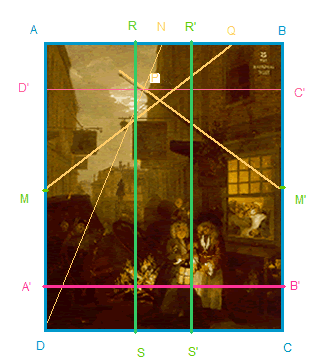
then the crossing obliques MQ and M’P (from the middles of a vertical sides) carry the staffs of the two inn-signs.
If the verticals and horizontals marked the chiaroscuro points, the obliques point to the dark silhouettes againt the sky.
The network of fundamental construction lines throws into relief the light and shadow effects in relation to the obliques, in outlines emphasising the sense of relief.
A comparison between the four paintings underlines the ironies of the echoes in the construction:
the lines which in Night marked the light sources are recalled in Morning to point to the brasero as well for one of them, while the other line underlines, not a dark lantern, but the symmetrical motif of the bright yellow dress of the old prude, who carries her fan in an inviting manner.
In Noon, such lines symmetrically indicate the door of the French huguenot church in London, and in Evening they cross the fattening woman placed as a counterpart of the horned cow.
In Hogarth’s vision of cityscape, the structural lines are fixed by the human figures and the objects rather than by the architectural setting.
The cone of vision
- Canaletto, View from Richmond House towards St Paul’s
- (1747, By courtesy of the Trustees of the Goodwood Collection)
[click on the picture to enlarge it]
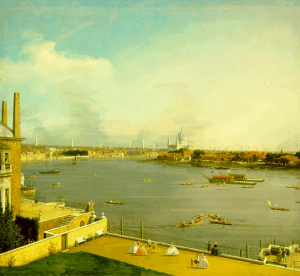
In the view from Richmond House (one of a pair of companion pictures), Canaletto’s composition places St Paul’s slightly off-centre while focusing on it.
- Cone of vision
- [click on the picture to enlarge it]
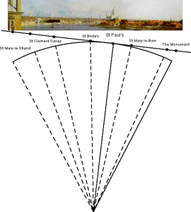
The angular proportions between the buildings seen from Canaletto’s viewpoint are accurate near St Paul’s (in particular between St Bride’s, St Paul’s and St Mary-le-Bow) though they are slightly right of centre: he must have seen the arc of circumference of his view as if projected on a tangent touching the circle not in the exact middle of the arc but on St Paul’s.
St Paul’s is also thrown into relief by lighting effects.
A master’s secrets
Canaletto’s choice of lighting
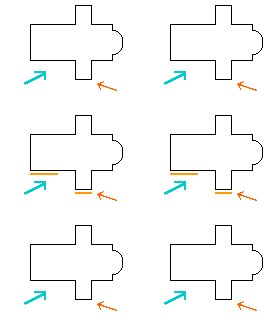
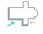
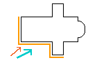
The sun shines from the South East - obliquely from the right, perpendicular to the view.
The walls of St Paul’s are alternately in full light and in the shade.
The South transept casts a shadow under the dome which throws it into relief since it is in full light ; the slanting direction of this shadow relates the several perpendicular walls (nave and transept)
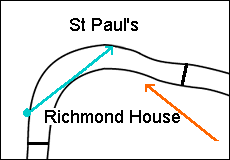
direction of the view
direction of the sun
Canaletto has chosen the lighting which caused oblique shadows to relate the various parts of the building.
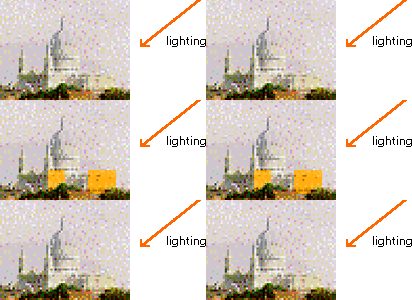
In the next screen, St Paul’s has been redrawn with other directions of light and shadow so as to show the options he rejected because they failed to produce this effect.

- View from Richmond House towards St Paul’s (in a pair of companion pictures)
[click on the picture to enlarge it]
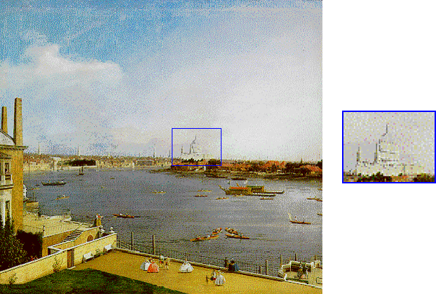
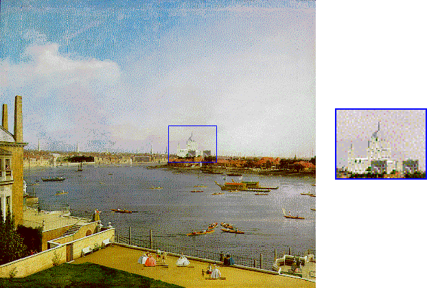
The direction of the lighting chosen by Canaletto is the best possible one to throw St Paul’s into relief, as shown by a simulation of the other options when the lighting changes as the sun moves from East to West.
Atmospheric effects
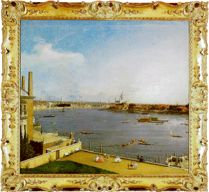
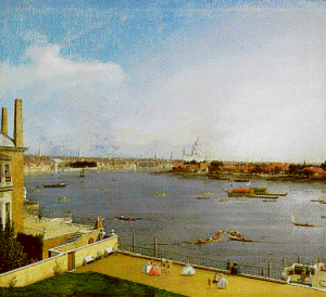
- Canaletto, View from Richmond House towards St Paul’s
- (1747, By courtesy of the Trustees of the Goodwood Collection)
[click on the picture to enlarge it]
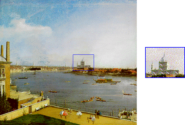
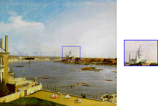
Canaletto has followed the pictorial practice of emphasising spatial recession by contrasts of alternating light and shade for the various distances ; but he did so only for the foreground and for the major buildings of the middle distance such as St Paul’s.
For the minor background buildings, he has on the contrary fused them with the atmospheric effects, placing the sunlit side of the spires against light patches of sky whereas their shaded side is close to darker clouds.
The Venetian atmospheric influence is shown in the Animation
Atmospheric effects - Animation

